When Hidden Discounts Hurt Revenue — A Melaka Redesign Story
A UX case study on improving promo visibility and purchase urgency at Melaka catalog platform.
Context
The moment when you launch a feature you’ve poured your heart into, only to realize… it’s not working as planned?
That was me during my time leading design for Melaka catalog, an online catalog to replace e-commerce. We’ve partnered with Nona Rara Batik, one of Hypefast brand. Their audience is called JengSis was loyal, but not always tech-savvy. Some struggled with familiar marketplaces, let alone a new app. We learned this the hard way.
During the Road to 8.8 and Merdeka Sale campaign, we leveraged Instagram Stories with bold product prices to stir FOMO (this is nice collaboration between tech and brand team). It worked—interest spiked.
But...
when users landed in the app, they couldn’t easily spot the best deals. We were asking users to hunt for value instead of delighting them with it. Then came Road to 9.9 campaign. Inside the app, we placed heavily discounted items under the “Semua Produk” tab. Still, no visual cues highlighted these steals. No “Sisa 1” urgency. It hit me then: good design isn’t just about aesthetics. It’s about creating clarity in moments of decision. The result, we generated sales but it’s only 5 orders from 2 campaigns.
So we rolled up our sleeves.
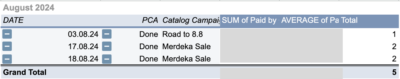
August 2024 Orders
Pain Points
From the background we conclude that we have 2 pain points:
- No urgency effect on our catalog (because we are not showing the stock)
- No visible discount (we only show the slashed price without how much the discount is ← like marketplaces did)
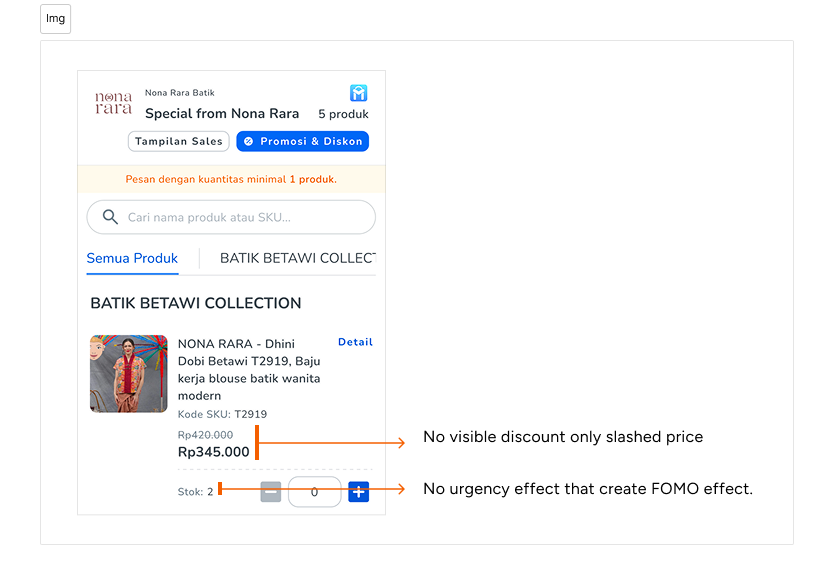
The pain points we found so far
Process
As IC’s Product Designer I responsible to tackle this task. First thing first that come in my mind is I have to take a look what our market leader do (Tokopedia & Shopee). I did quick research to tackle both of pain points above.
I found that in marketplaces they delivered design like this.
- On the left is Tokopedia, they deliver the discount value on the right of the slashed price.
- On the right is Shopee, they deliver the discount value on the right of the slashed price but slashed price is on the right on the final price.
Then after the quick research, I present it to product team when brainstorm about the improvement that we can do to increase the conversion. After a discussions we decide to bring this to up to the initiative for development. Why?
- We have a conclusion that when market leaders do it, then why we are not try this.
- I realize this discount value also in the `highlight` mode with bright red color to attract customers to click, especially if they are in the big discount.
We come closer to the design solution...
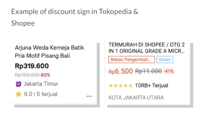
Tokopedia & Shopee Product Card screenshot
Solutions
This part is consist of the design I created for the improvement.
The improvement is:
- We are giving the discount indicator with it’s value.
- We are giving the color of urgency: orange in the stock
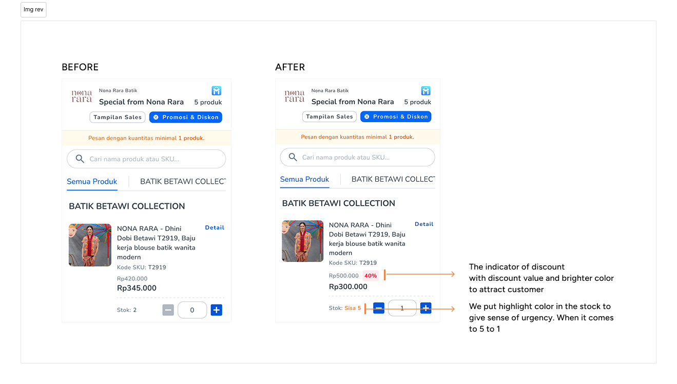
The before and after design
Impact
So, what happened after we untangled those hidden discounts and redesigned the experience?
The results speak for themselves:
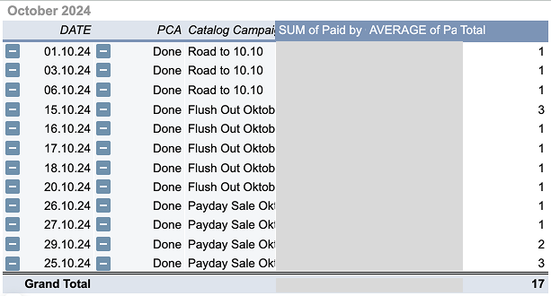
Orders started rolling in.Within just 1.5 months of launching the improvements, we saw 17 solid orders (+41% vs last month) generated directly through the catalog platform, real purchases from JengSis that already use the platform.
We have august order (7 orders) while waiting the development of this
This wasn’t just a UI win. While we cleaned up the interface to highlight promos and create urgency, our brand and marketing partners also stepped up their game. They refined how they marketed the campaigns—aligning ads with the new clarity in the app. It became a seamless experience: from seeing the ad, to landing in the catalog, to spotting the deal, to tapping “Checkout.”
We didn’t just move pixels—we moved people. And that’s the kind of impact that lasts.
