What is Flowchart?
January 1, 2026
The Strategic Challenge
At Melaka, we developed a streamlined catalog platform designed to bridge the gap between social commerce and traditional e-commerce. Our pilot partner, Nona Rara Batik, serves a loyal customer but specific demographic nicknamed JengSis.
Despite we have a strong top-of-funnel interest driven by Instagram FOMO campaigns (8.8 and Merdeka Sales), our conversion data revealed a significant leak. Users were landing on the platform but failing to convert at the expected rate (the target back then was at least 10 orders)
The data was clear: while the marketing team was effectively generating hype, the product experience was failing to close the trust and value gap at the moment of decision. We were generating interest, but not intent.
From the order total we see only 5 orders was generated.
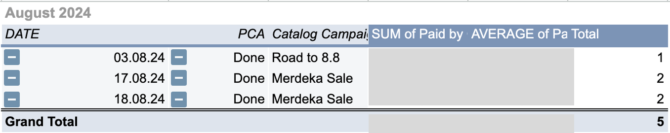
August 2024 Orders
Pain Points
After did a desk research to check the pattern from the biggest e-commerce (Shopee and Tokopedia), we identified two primary frictions:
- Lack of urgency indicators (stock levels were hidden).
- Low price transparency (discounts were noted but not visually quantified).
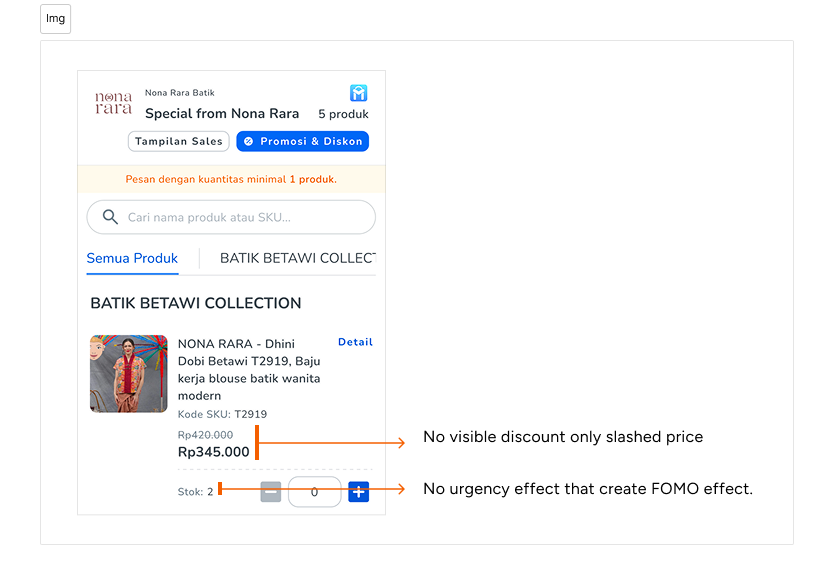
Pain points of the existing catalog experience.
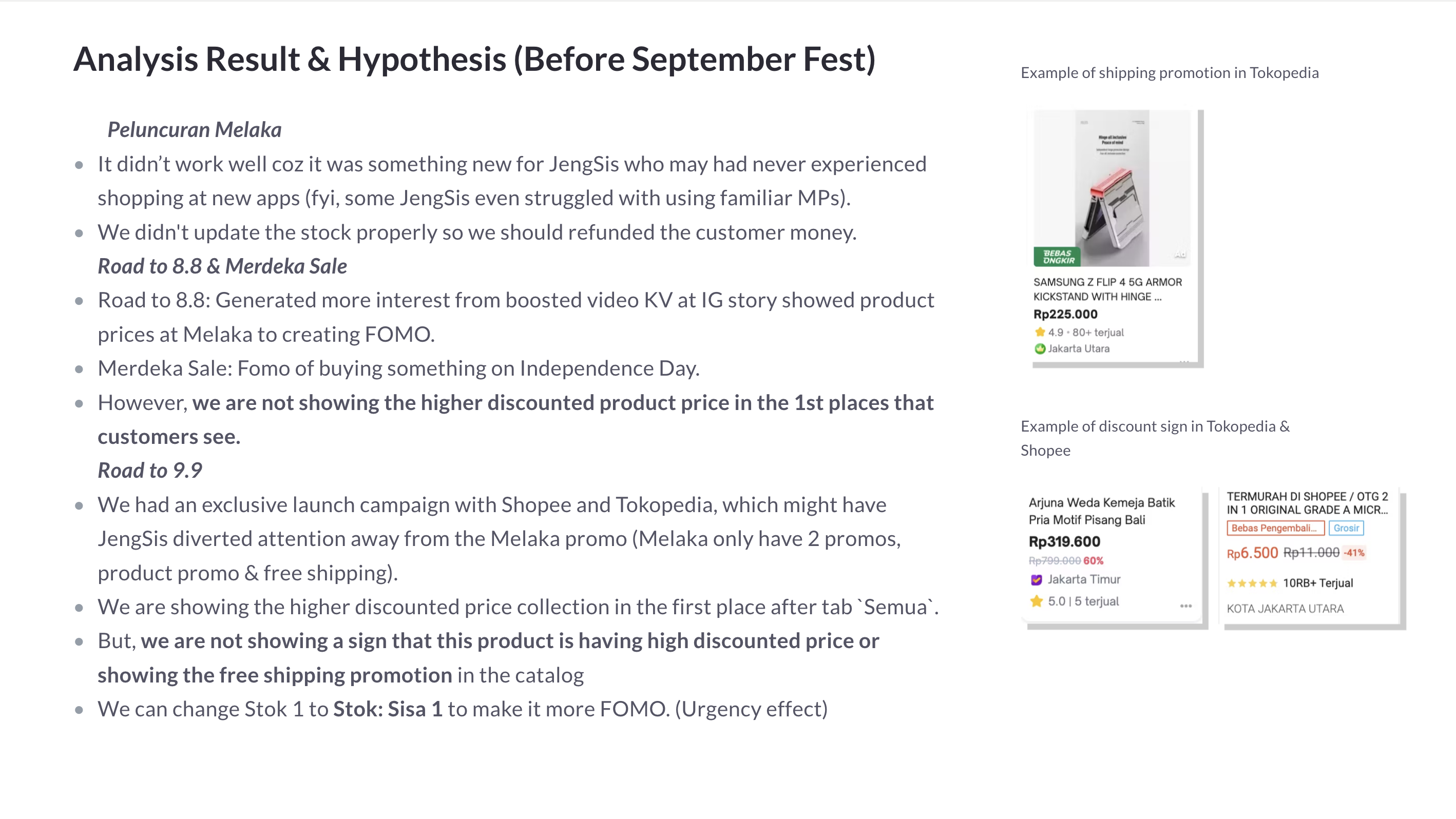
Complete notes from the campaign:
Complete notes from the meet.
Competitive Benchmarking & Pattern Validation
As the Designer, I moved beyond visual updates to analyze mental models in the Indonesian e-commerce landscape. For our demographic, excessive innovation can be a barrier if it breaks familiar utility patterns.
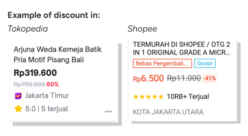
I conducted a comparative desk research from market leaders: Tokopedia and Shopee, to identify universal cues for value recognition and scarcity.
Insights from the audit:
- Visual Anchoring: Highlighting specific savings percentages in high-contrast badges significantly improves value perception from the buyer (they both use this).
- Relative Urgency: Low stock indicators help reduce decision paralysis by providing clear context.
By adopting these established patterns, we aimed to reduce cognitive load and allow users to rely on existing habits.
Solutions
The design improvement that I focused on two core improvements:
- Integrated clear discount indicators with precise values (e.g. -10%).
- Introduced orange urgency indicators for low-stock items or how many stock available (e.g. Stok: Sisa 2, Stok: 10).
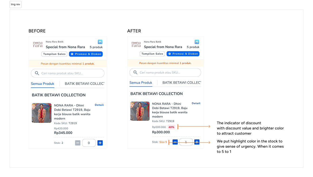
Before and after comparison of the product card optimization.
Business Impact & Reflection
By aligning our UI with existing user, we saw immediate quantitative shifts within 45 days after it's deployment:
- Order Volume: Increased by 41% month-over-month.
- Conversion: Bridged the gap between marketing campaigns and product checkout, resulting in 17 direct orders in the next cycle.
My role was also communicate with brand to ensure that the marketing strategy was structurally supported by the product experience. I didn’t just move pixels to design the experience, we as the team also built a scalable revenue engine.
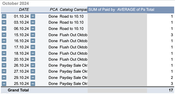
Conversion growth post-deployment.
What I've learned from this improvement project
I know that the product experience is not a magic bullet itself, it also supported by brand that increase their marketing effort to increase the generated order. But with this improvement I believe we can improve our user journey experience when buying the stuff from Nona Rara Batik.
Xiexie.

